
In-N-Out
desktop and mobile website redesign
Overview
Since I can't publish the proprietary work I did for a food and beverage client, I wanted to complete a personal project that showcases some of the skills and design practices I gained from the project. I chose to complete a redesign of the In-N-Out desktop and mobile website experience.
TOOLS
Figma
Skills
UX design, visual design, adaptive design, accessibility
time
6 weeks, winter 2023
Solution
Redesign the in-n-out.com website to enhance its classic branding and improve the user experience.
Problem
In-N-Out's website isn't engaging and doesn't meet modern UX and accessibility standards.
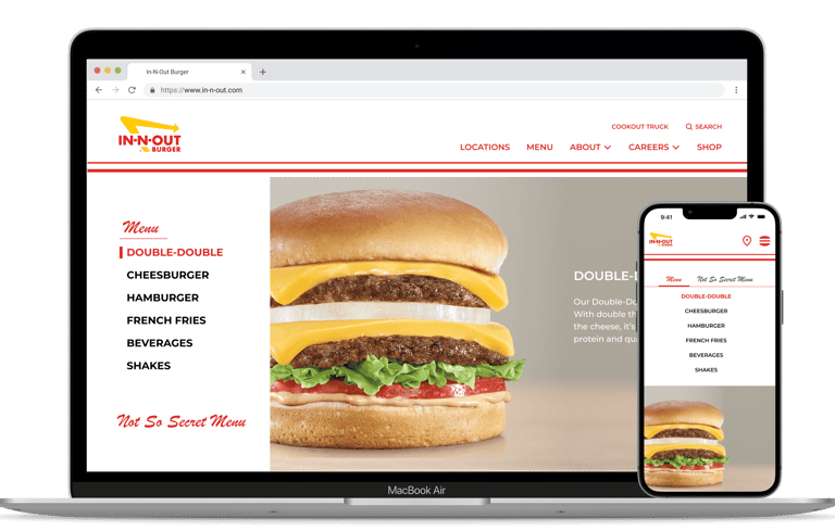
sneak peek of my final designs
Preliminary Work
PRIMARY USERS
Following some assumptions based on In-N-Out's website layout, I determined two primary user groups: new customers who want to know In-N-Out's menu and prospective employees.
Secondary users I wanted to engage are large event coordinators interested in booking the Cookout Truck and dedicated In-N-Out fans looking to purchase merchandise.
New Customer
California tourist unfamiliar with the menu


prospective employee
looking for part-time or corporate roles


large event coordinator
booking the Cookout Truck

In-N-Out Fans
exploring In-N-Out merchandise
Site Evaluation
I went through the website and immediately noticed that the site does not practice modern UX or accessibility standards. There is also room for improved visual design and site organization.
Information Architecture
in-n-out.com has numerous hyperlinks, tabs, and popups but no sub-menus. I created a site map to understand how the pages connect.
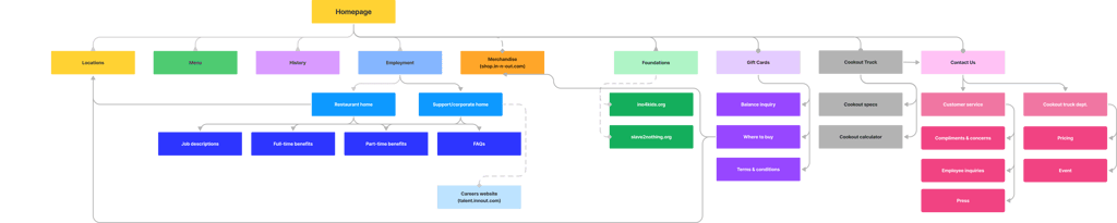
In-N-Out site map
Competitive Analysis
I conducted similar site evaluations of competitors, including Shake Shack, Five Guys, and Chipotle. I noted the commonalities in fast-food restaurant websites, brand identities, and user flows.
Project Goals
UX design
Create a simpler and more accessible user experience
Visual Design
Enhance the visual design and brand identity of In-N-Out
Create consistency across the desktop and mobile experience
Responsive design
Using my preliminary work, I set the following goals to guide my design work.
Redesign
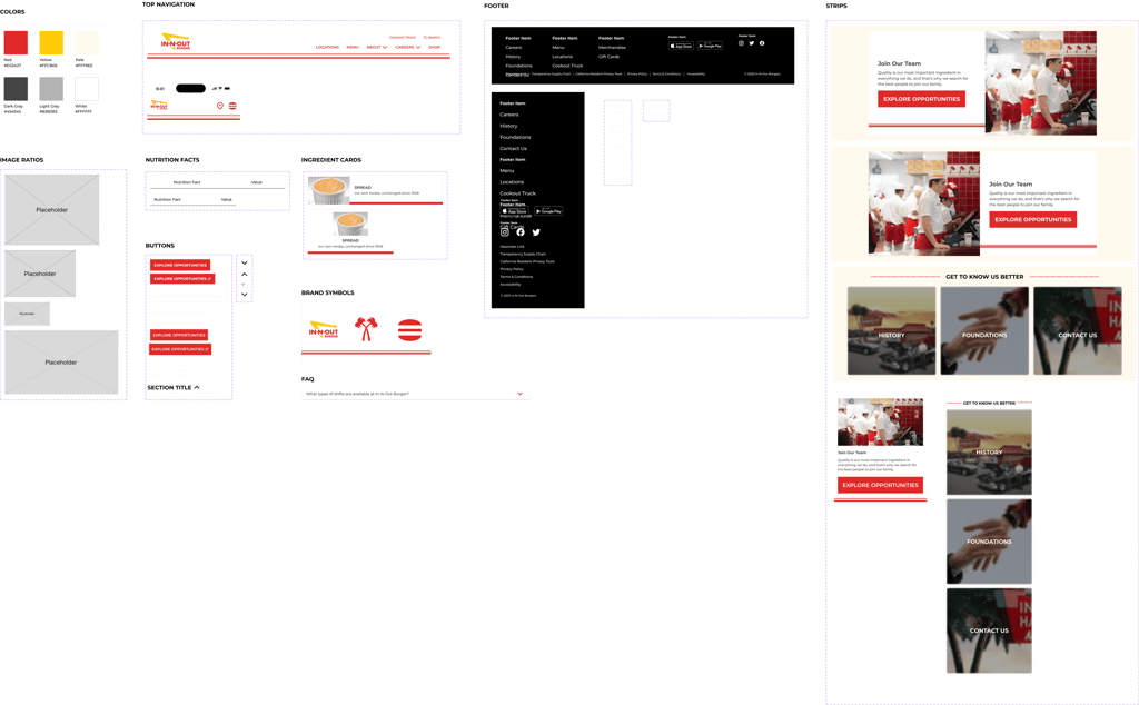
enhanced brand identity
In-N-Out has symbols that are core to its identity. A few are the crossing palm trees, the yellow arrow that always points toward the restaurant, and the double red lines. I incorporated these symbols throughout the website to tie the pages together and strengthen In-N-Out's visual identity.
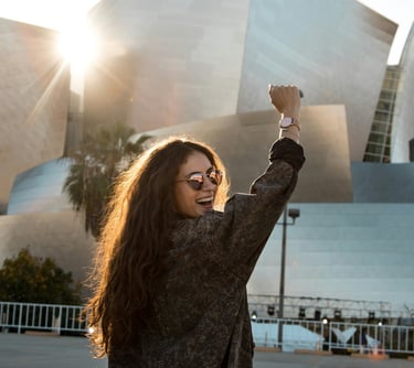
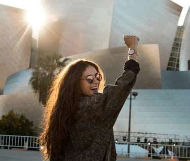
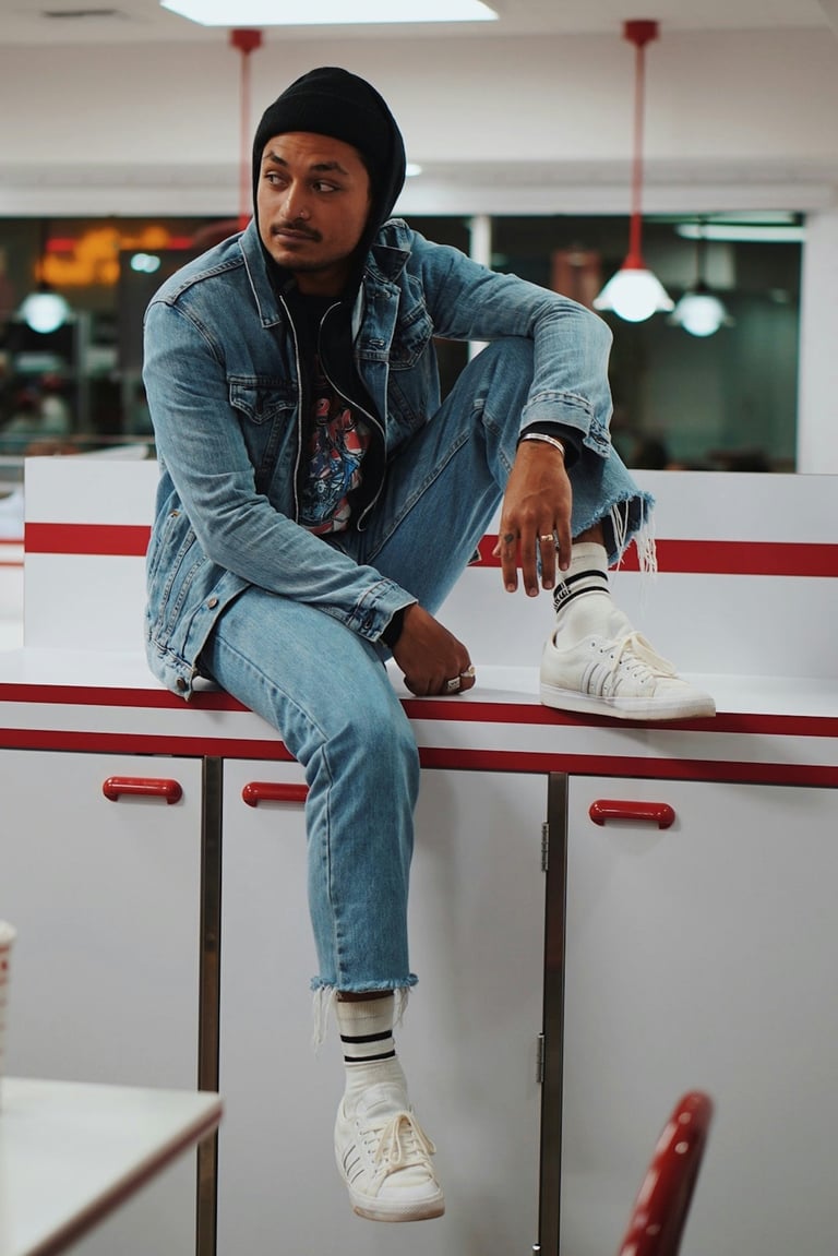
In-N-Out is also known for its friendly face-to-face service. However, the website has very staged photos that lack real people engaging with the products. I chose to use more candid photography to convey In-N-Out's people-forward values.

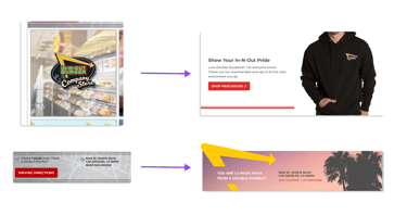
example of changes to enhance brand identity, accessibility, and SEO
Simplify info architecture
I wanted to simplify the In-N-Out site by creating submenus and surfacing content hidden behind links. This reduces the steps to access essential information and prevents users from getting lost among all the subpages.
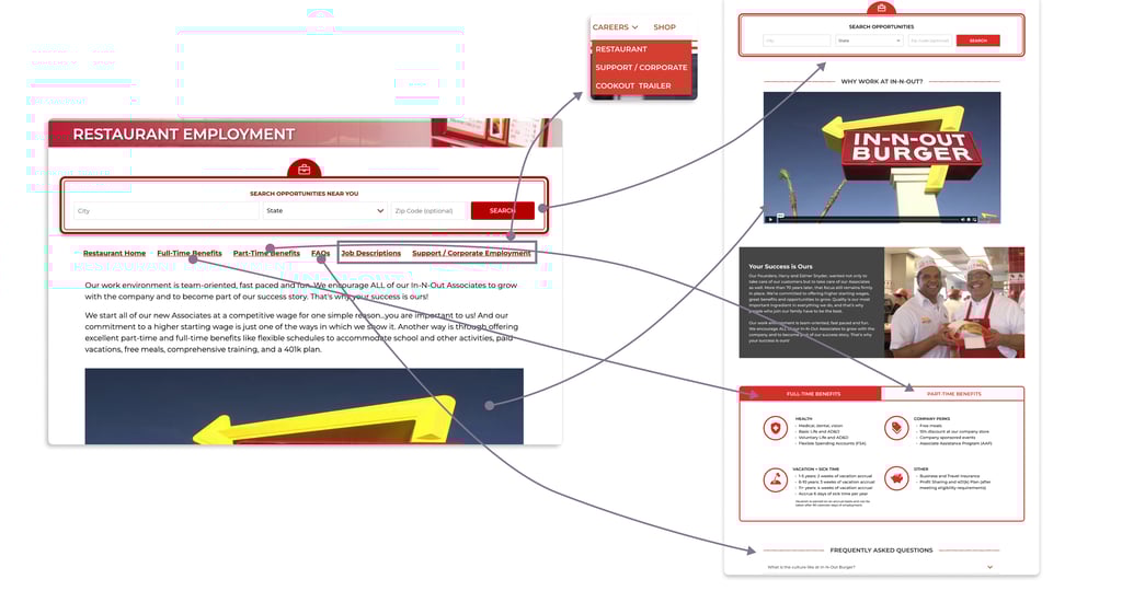
example of how I surfaced information from the employment page
design system
I developed a mini design system in Figma to build my screens. I added a couple of neutral colors to the In-N-Out palette, designed new assets, and created desktop and mobile variations.
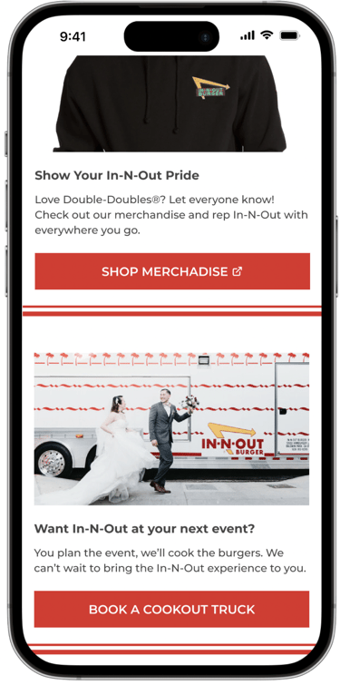
Homepage
I started my redesign with the homepage. The existing homepage features tiles that have inconsistent styles and rely on text within images, which screen readers can't read. There are also strange placements of privacy tools and social media icons. My changes:
Redesigned menu and footer for simpler site navigation and more direct access to subpages
Stacked content to reduce cognitive load and target key site users
Visual design and accessibility changes, including natural imagery, more brand elements, and indicators of external sites
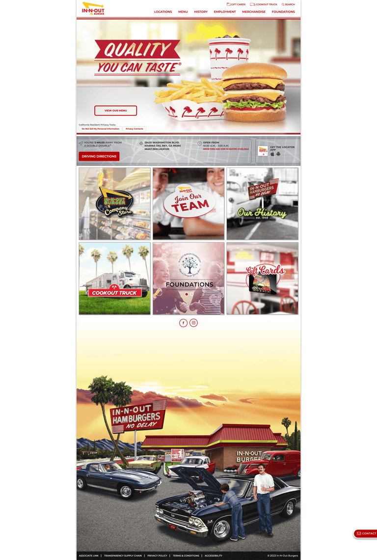
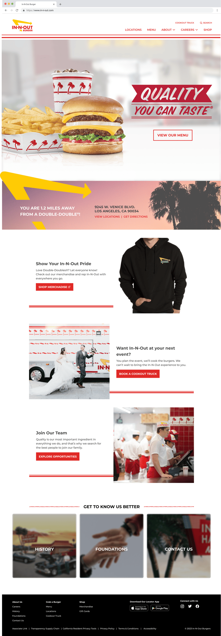

BEFORE
AFTER
Menu
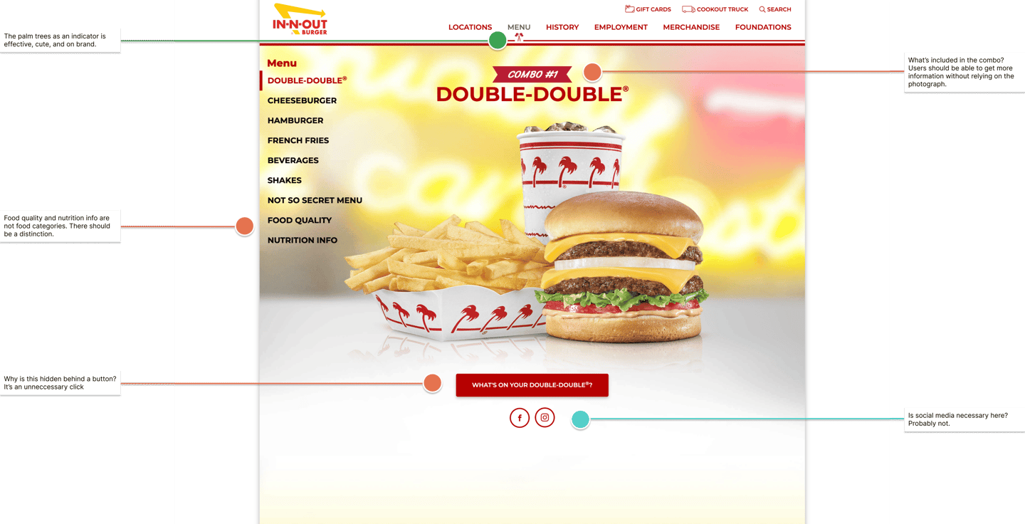
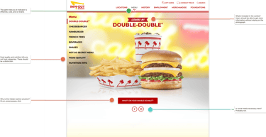
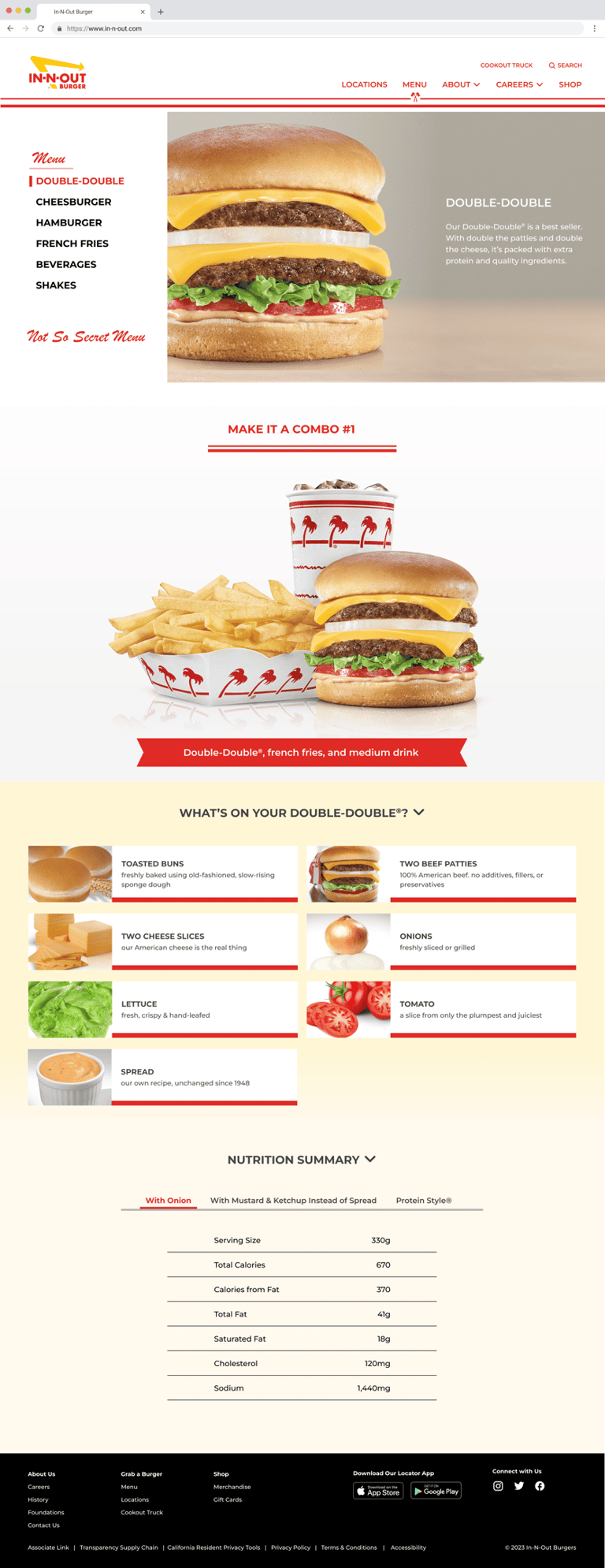
Although the In-N-Out menu is simple, the website's menu page is frustratingly complex. Non-menu items like nutrition facts and food quality are placed under the menu, and the ingredients are hidden in an image carousel. My changes:
Focus on the specific menu item, with the combo meal moved below the description
Menu item descriptions to optimize SEO and entice customers to try the food
Collapsible sections to view nutrition facts and ingredients. Users can view more information at their discretion without the need to navigate to a separate page.
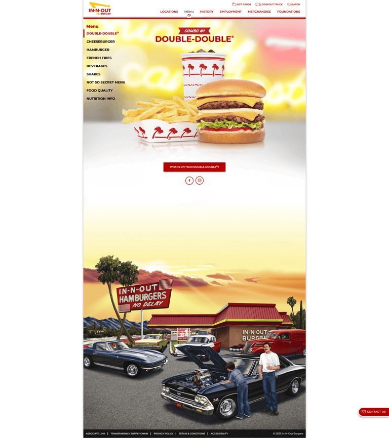


BEFORE
AFTER
Careers
The current careers page hides information behind hyperlinks that are used as tabs. There are unclear paths for finding the external career sites for corporate and cookout trailer employment. In-N-Out also doesn't promote itself as well as its competitors. My changes:
Submenu in the top navigation to directly access tailored careers pages for each type of employment
Renaming Employment to Careers to suggest long-term growth and benefits
Taking information out of tabs and making the page scrollable to surface valuable information and reduce the number of clicks
Employee images and value statements to represent In-N-Out's positive work culture and commitment to its employees
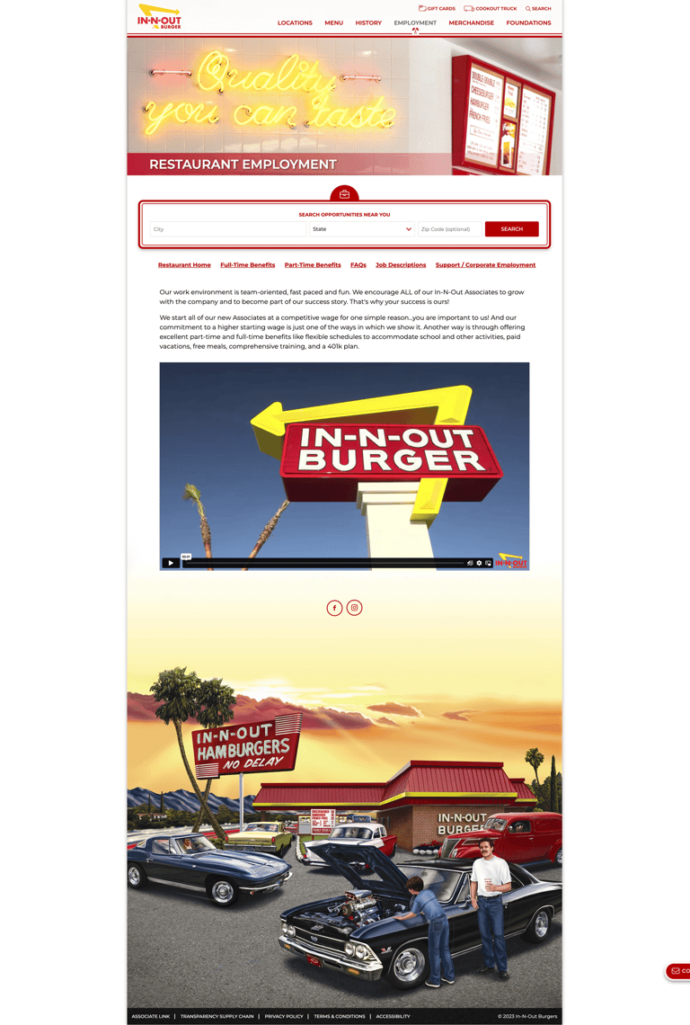
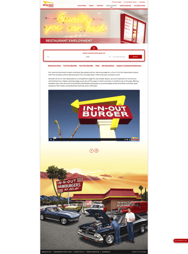
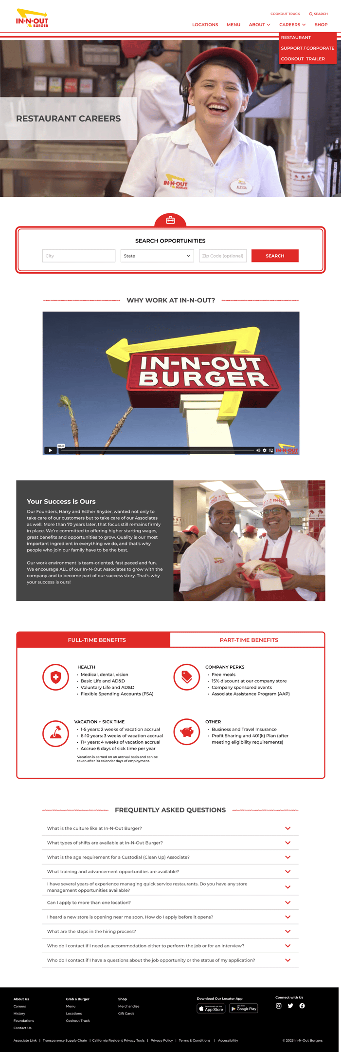

BEFORE
AFTER
Reflection
This project was great for me to practice my UX, visual, and accessibility design on desktop and mobile devices. As a food lover and proud Californian, I really enjoyed working on a brand that I grew up with.
I also gained insight into the complexity of website architecture, especially in the careers section. I explored competitor websites and dived deep into the various tabs and links on the existing site to determine the best way to organize the information.
This redesign was fun for me, and it reminded me why I love doing consumer-facing design and working with organizations that have personal significance to me.