code.org
designing accessible learning tools
OVERVIEW
I spent two summers at Code.org, a nonprofit dedicated to expanding computer science education around the world, especially among women and underrepresented minorities. During my first summer, I supported the CS Fundamentals (CSF) team in creating code documentation and activity exemplars for teachers and students. In my second summer, I worked with the organization's sole designer to evaluate tools for at-home learning, create design assets, and design new coding tools.
Throughout these internships, I developed stronger design and coding skills, as well as gained valuable knowledge about pedagogy to address diverse student groups worldwide. I valued applying my technical skills to my passion for equitable education.
Tools: Figma, Google Suite, Code.org platforms
Skills: UX design, visual design, usability testing, JavaScript, HTML, technical writing
Role: UX Design Intern
Education Team Intern
Time: summer 2020 - spring 2021
summer 2019
FIRST-TIME USERS
PROJECTS
Since I worked on two different teams over the course of two years, I took on several projects with a wide range of scope, goals, and required skill sets. Although these categories don't encompass all the work I did at Code.org, they demonstrate the biggest impacts I made as both an education and design team member.
First-time users represent a core group that I served. I designed experiences to help teachers and students navigate Code.org for the first time.
Sprite Lab is a product that I worked on during my time on both teams. I documented Sprite Lab's coding blocks and designed new features to make the tool more flexible and enjoyable for students.
FIRST-TIME USERS
SPRITE LAB
FIRST-TIME USERS
HELP TOOLS
PROBLEM
The pandemic created the need to adjust curriculum and tools for at-home learning.
GOALS
-
Make help resources visible and intuitive
-
Create a product tour of App Lab
-
Add tooltips to App Lab
-
Integrate code documentation
-
Design for desktop and mobile devices
HELP BUTTON PROCESS
Currently, documentation and tutorials are located in a help menu whose contents change depending on the webpage. Since there is no indication that the contents change, App Lab help tools are rarely discovered by users. We wanted to determine a way to integrate help resources into the coding studio.
I started by exploring how other organizations incorporate help tools and documentation into their coding platforms. I used my research to ideate a variety of designs, from simply locating help tools through a '?' button to designing a completely different menu bar.


Problem: help menu changes depending on the page
HELP BUTTON IDEATION
Collapsible documentation panel - most promising idea
✅ Pros: provides help in the same window, can be viewed next to code, option to view the full documentation
❌ Cons: covers the app screen

'?' button in toolbox
✅ Pros: small icon, located near the tools that students would need help with
❌ Cons: help button would open another tab or window

'Coding Help' button in workspace
✅ Pros: uses icon and text, easily discoverable
❌ Cons: not located near the tools that students would need help with

Helper Toggle
✅ Pros: contains all forms of help, includes a new helper tool
❌ Cons: requires a lot of engineering work, difficult to translate to mobile devices

PRODUCT TOUR PROCESS
The product tour can be added in addition to the in-studio help tools. The product tour aims to help first-time users who are exploring App Lab on their own and not in the typical classroom setting. It can also be used by students who forget how to use App Lab.
I first reviewed the classroom curriculum that introduces students to App Lab. I then applied the main points to an interactive tour that reviews the basics.
PRODUCT TOUR


USABILITY TESTING PROTOCOL
PROBLEM
Code.org didn't have an established way to conduct and record official usability testing.
Informal testing took place across teams, but no one was trained in proper usability testing or data recording techniques. We also needed to focus on how we could conduct tests remotely since we were in the middle of the pandemic and regularly communicate with users from all over the world.
GOALS
-
Make it fast and easy for anyone within the org to initiate, host, and evaluate remote usability tests
-
Increase communication, accessibility, and engagement with (and for) a diverse set of users
-
Create a standardized and repeatable testing method (+ best practices) to mitigate inconsistencies across tests, nervousness, and bias
PROCESS
1a. Develop the protocol
I did research to understand usability testing best practices and compiled them into a document for all team members to reference. I then developed a usability testing protocol and script for evaluating the experiences of first-time Code.org users. Although understanding user pain points was an added benefit, the main goal of testing was to practice the process of conducting remote usability tests.
1b. Translate into Spanish
Since one of our goals was to make accessible tests for diverse users, we had to consider our international users. I worked closely with our international team to create a copy of my usability scripts in Spanish. My scripts act as templates for future usability tests.
Find out how to teach the Dance Party Hour of Code lesson.
Descubra cómo enseñar la lección Dance Party Hour of Code.
2. Set up data recording template
Since Code.org doesn't have a dedicated user research team, I wanted to create a data collection process that's simple to use, accessible for all teams, and collects all the data in one place. This spreadsheet includes any information that might be useful for evaluating user experiences, including participant details, a link to the usability test recording, key findings, and separate sheets for details on each task. Like the script, it can act as a template for future usability tests.

3. Recruit participants
Considering our goal was to test our usability testing process and not evaluate first-time user experiences in-depth, my team used our personal networks to recruit participants. We recruited three teachers and six students from around the United States and Costa Rica.
We wanted to test with students in different K-12 grades, participants in other countries, and participants with low internet bandwidth.
These diverse conditions would allow us to apply our protocol in different conditions and practice tackling challenges facilitators may face when running usability tests.

4. Run the tests
My team of three rotated as facilitators and notetakers. This allowed us to practice the scripts and observe how different people approach usability testing.
While the tests with participants in the United State ran rather smoothly, we faced difficulties when working with the Costa Rican participants. Both had poor Internet and joined Zoomed from their phones, so they didn't share their video or their screens. As a result, our team couldn't see how they navigated the site. We had to rely on their think-aloud thoughts, which were hard to visualize and didn't convey all their emotions and mouse clicks. As frustrating as the process was for us and the participants, it was a good learning experience for the technical requirements and workarounds needed for future international and low-bandwidth tests.
summary of our participants' thoughts

TAKEAWAYS
This hackathon project was a success for testing our new usability testing protocol. In addition to developing script and data collection templates, I took notes on changes that need to be made for future iterations.
Our next steps are to conduct another round of testing our usability testing protocol. We also want to translate our scripts to more languages so that we can test with participants around the world. Finally, we need to determine ways to work around situations when participants cannot share their screens.
-
Zoom is an ideal platform for conducting and recording remote tests.
-
It's important for facilitators and notetakers to practice, especially when it comes to using technology and asking open-ended and follow-up questions.
-
Facilitators need to remind participants to think aloud.
-
Facilitators should be prepared for users to get frustrated.
-
Our protocol could benefit from more testing in diverse conditions.
SPRITE LAB
WELCOME TO SPRITE LAB!
Sprite Lab teaches basic object-oriented programming through block-style coding. Sprites are objects who wear "costumes."
Sprite Lab

COLLECTIONS
PROBLEM
Students weren't engaging with free-play levels that allow them to create projects with whichever sprites they would like.
The CSF team suspected the lack of engagement was due to the following problems:
-
The existing sprite collection has disconnected styles, making it difficult to feel inspired.
-
Finding and adding costumes requires too much time searching and clicking through multiple steps.
-
Backgrounds are in a different section than costumes. This exacerbates the first two problems of inspiration and search time.
GOAL
The proposed solution from the team is Collections:
Collections will provide students with cohesive sets of costumes and backgrounds to inspire creativity. They should replace the overwhelming and incohesive default dropdowns making it easier for students to create with Sprite Lab by providing a clear starting point to generate creative ideas from.
My task was to design the Collections screens and determine how this new functionality would fit into the existing Sprite Lab.

The default sprites are uninspiring.

A given example of what a collection would contain.
ITERATIONS
Sprite Lab Collections went through several iterations, and the design requirements and terms even changed throughout the process.
Tabs in the dropdown
In my first mid-fidelity iteration, I wanted to change the existing Sprite Lab interactions as little as possible. I simply added tabs to organize the sprites by themes and categories. (This was designed when the original design requirements didn't involve backgrounds and referred to Collections as Themes.)
✅ Pros: very subtle changes to the existing Sprite Lab, organizes sprites
❌ Cons: difficult to see on small screens, doesn't work with backgrounds


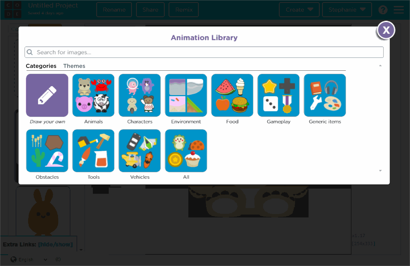
Add from the animation library
When users click the "Draw" button in the sprite dropdown, the animation library pops up. In the costume library, sprites are already organized by categories. I suggested adding themes as a way to organize the sprites.
✅ Pros: uses existing animation library popup, students can add a whole theme of sprites at once (one of the original design requirements)
❌ Cons: doesn't really reduce the number of clicks to find and add a sprite, still not very inspiring
added a Themes tab and an add all button
NEW DIRECTION
My team got a new product manager who took over this project, and the design spec changed to contain the requirements that I listed under the task section. The concepts behind a sprite, animation, and collection vs theme were updated, and the costume selection grew from a couple hundred to over 1,000 sprites.
The following shows the most recent iteration, which is an entirely new layout for sprite selection that makes searching, selecting, and organizing sprites much faster and easier.
✅ Pros: users can add multiple sprites at once, sprites and backgrounds are shown together, number of steps to complete common tasks is reduced
❌ Cons: this is an overhaul of the existing Sprite Lab and requires the most time to implement
What started as a simple project evolved into a much more involved design task.


allowed multi-select
redesigned a new mode to view costumes and background
the flow of the new graphics mode
STAY TUNED
This project was still in progress by the time when my internship ended. I'm looking forward to seeing which features were implemented in the next update of Sprite Lab!
DOCUMENTATION
PROBLEM
The CSF team didn't have any written or organized public documentation for Sprite Lab.
Although there's existing documentation for labs that use written code, block-style coding needed a different approach because it is image-based and designed for users who are not familiar with technical computer science language.
I headed this project during the last 3 weeks of my Education Team Internship.
Sprite Lab example project
PROCESS
1. Name the blocks
Students need to understand what the block does, while teachers need a clear and concise way to reference a block in their lessons.
A new approach had to be made to name blocks that were primarily pictures in a technically accurate but easy to understand way.
Example 1: My team named this sprite block make a new (named) sprite. This differentiates it from the block that makes a new sprite without a name, is easy to reference, and describes the block well enough to find it in the documentation list.
Example 2: Typical computer science syntax would use "get property" to read an object's property, like size. While it's good practice, this concept is not taught to elementary school students in the Code.org curriculum. Therefore, I named the block "sprite property" to be identifiable without having to introduce getter and setter methods to students.
make a new (named) sprite

sprite property
2. Writing beginner-friendly descriptions
The descriptions for each block had several important requirements:
1. Explain the blocks' functions and be as technically accurate as possible
2. Easy to understand for elementary school students and new CS teachers who are unfamiliar with advanced programming concepts
3. Discuss the many possible uses of the block while remaining concise
Meeting these requirements was tricky at first, as I had to think back to how I first learned computer science and apply it to how I can teach it to others. Further, I wanted to keep description formatting and wording consistent across documentation for a seamless experience.

3. Coding diverse examples
My final step in creating the documentation was coding examples that demonstrated the various uses of each block. I enjoyed this step the most, as I could be creative with making projects I think an elementary school student would enjoy.
I practiced designing for users of different backgrounds, identities, and interests, as well as accessibility to different forms of technology.
I intentionally created examples that could appeal to students of different genders, cultures, and interests, using nearly every sprite in at least one example. My examples also vary in their use of the mouse, keyboard, and sound so that they can be interacted with across devices.


These examples show different uses of the block "change color."

REFLECTION
My internships helped me further develop my computer science, user experience, and design skills through working on projects that reach millions of students.
One of my most valuable takeaways was learning to design for diverse users. In this case, diversity was more than just different cultural backgrounds and interests; users were diverse in their technology access, language, and role in the classroom. Considering these characteristics made me more aware of the importance of creating products that can be edited, translated, and meet accessibility guidelines. Code.org also faces larger diversity challenges, like how to encourage more women and underrepresented minorities to engage with computer science. Gaining first-hand experience with these challenges pushed me to consider how I can address social issues in my future work.